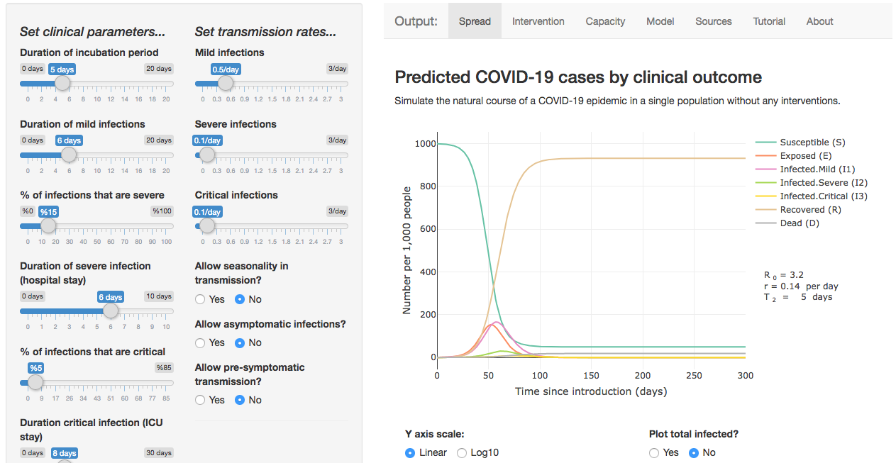
A useful app, put together by Harvard research fellow Alison Lynn Hill, lets users explore various “flatten the curve” interventions and compare levels of healthcare resources required in different scenarios.
[Use the app here.]
[Github here].
Dr. Hill explains:
The app is based on an SEIR epidemic model, adapted to include the different possible clinical stages/outcomes of COVID19 infection. All the math is there for anyone who’s interested, and the code (R) is all open source on Github so feel free to edit to fit your own needs.
The model is parameterized w values taken from the (surprisingly vast) literature – thanks to everyone pumping out the pre-prints! If you don’t like the parameters I chose, no problem – you can interactively change them to anything you like and see how it affects outcomes.
Having a model that takes into account clinical progression can be useful for a few different things, like understanding the timescale of an outbreak, or estimating the expected # of “unseen” exposed or mild infections for every severe one you do see.
The app has the option to introduce an intervention, so you can generate your own “flatten the curve” scenarios. You can also see what happens if an intervention is stopped too soon.
Another section lets you compare cases of different severity levels to the healthcare resources needed to care for them, such as hospital beds or mechanical ventilators. You’ll see that really strong interventions are needed to keep cases under these capacity thresholds.