by CivicMeter Staff | Mar 31, 2020 | Uncategorized
The severity of COVID-19 outbreaks vary by state. One useful way to look at how the situation is escalating is by looking at hospitalizations, both as a raw number and per capita. See the full chart on the CivicMeter COVID-19...
by CivicMeter Staff | Mar 31, 2020 | Uncategorized
CivicMeter has added per capita data to our chart tracking COVID-19 cases in U.S. states. Confirmed case totals can be skewed by under-testing and other factors. This is true for raw numbers as well as per capita case totals. Deaths per 1 million, while still subject...
by CivicMeter Staff | Mar 31, 2020 | Uncategorized
Using University of Washington’s model, CivicMeter has charted the projected date of COVID’s peak in each U.S. state, as well as the healthcare resources that will be required during these peaks. Some states, like California, aren’t projected to run...
by CivicMeter Staff | Mar 30, 2020 | Uncategorized
Overall confirmed cases are a poor proxy for gauging where various countries are in their respective outbreaks. Active cases, although subject to under-reporting, is a better metric for determining which countries are facing the most severe outbreaks. View the entire...

by CivicMeter Staff | Mar 26, 2020 | Modelpedia, Uncategorized
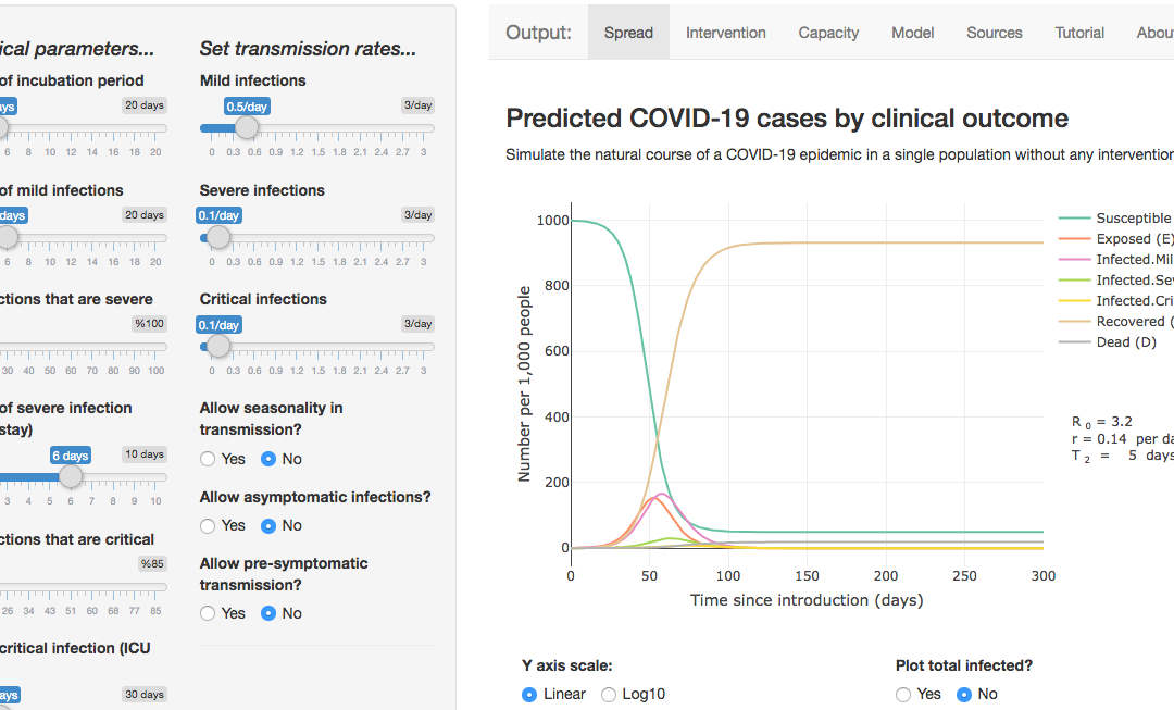
A useful app, put together by Harvard research fellow Alison Lynn Hill, lets users explore various “flatten the curve” interventions and compare levels of healthcare resources required in different scenarios. [Use the app here.] [Github here]. Dr. Hill...

by CivicMeter Staff | Mar 26, 2020 | Modelpedia, Uncategorized
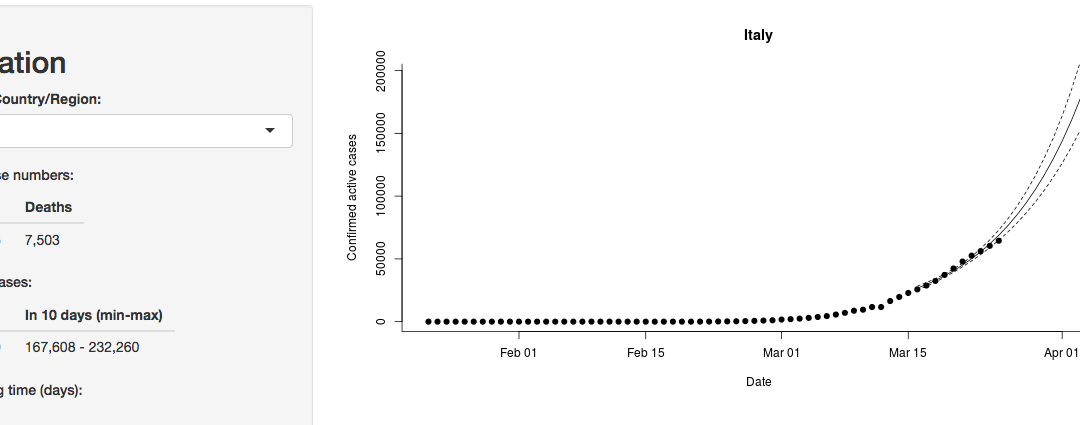
University of Melbourne has released an app designed to model how fast COVID-19 might be spreading in various countries, including Australia. See the application here. Code is available on the Github. Associate Professor Ben Phillips explains the model in a blog post:...


